In today’s hyper-connected world, smartphones have become an extension of ourselves. We use them for everything from checking emails and browsing social media to managing finances and ordering groceries. As a result, the way we design and develop applications needs to adapt to this mobile-first reality.
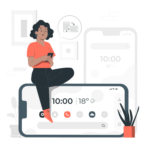
This blog post dives into the concept of mobile-first design, exploring its core principles and various strategies to create user-centric mobile apps. Buckle up as we explore how to prioritize the small screen experience without compromising functionality!
Why Mobile-First Design Matters
The dominance of mobile devices is undeniable. Statistics show that in 2023, over 6.6 billion people worldwide owned smartphones, accounting for nearly 80% of all internet users [Source: Statista]. This translates to a massive user base that primarily interacts with the digital world through their phones.
Here’s why mobile-first design is crucial for app success:
- Improved User Experience (UX): Focusing on mobile-first ensures a seamless and intuitive experience for users on their primary device. This leads to higher engagement, satisfaction, and ultimately, better app retention.
- Enhanced Accessibility: Mobile-first design prioritizes clear navigation, concise content, and functionalities optimized for touch interaction. This makes your app accessible to a wider audience, including users with disabilities or those using older devices with smaller screens.
- SEO Benefits: Search engines are increasingly prioritizing mobile-friendliness in their ranking algorithms. A well-designed mobile app can improve your app’s discoverability in search results.
- Cost-Effectiveness: Designing for mobile first can streamline the development process. By creating a strong foundation for the smaller screen, scaling it up for larger devices becomes easier and less resource-intensive.
Core Principles of Mobile-First Design
Mobile-first design revolves around a user-centric approach that prioritizes the needs and limitations of mobile users. Here are the key principles to keep in mind:
- Focus on Content Hierarchy: Prioritize the most essential information and functionalities for the mobile experience. Users should be able to find what they need quickly and easily without getting overwhelmed.
- Simplicity is Key: Keep layouts clean and uncluttered. Utilize intuitive icons, clear navigation structures, and concise text to ensure smooth interaction on smaller screens.
- Touch-Friendly Design: Design buttons, menus, and interactive elements large enough for easy tapping with fingers. Use a minimum touch target size of 48dp (density-independent pixels) according to Material Design guidelines (https://m3.material.io/) or 44px according to Apple’s Human Interface Guidelines (https://developer.apple.com/design/human-interface-guidelines).
- Responsive Design: While focusing on mobile, ensure your app can adapt to different screen sizes and resolutions. This allows for a smooth transition when users access the app on tablets or desktops. Utilize responsive frameworks like Bootstrap or Foundation to achieve responsive layouts.
Design Technicalities for Mobile-First Apps
Beyond the core principles, let’s delve into some technical considerations for mobile-first design:
- Grid Systems: Utilize a flexible grid system to structure your layouts. This ensures elements resize and rearrange proportionally across different screen sizes. Popular frameworks like Bootstrap and Material Design provide pre-defined grid systems.
- Scalable Vector Graphics (SVGs): Use SVGs for icons and logos. Unlike raster images (JPG, PNG), SVGs are vector-based and scale seamlessly to different resolutions, maintaining crisp visuals on high-density displays (Retina, AMOLED).
- Font Choices: Select fonts that are readable at small sizes and offer good contrast against the background. Consider using system fonts (pre-installed fonts on the device) for wider compatibility. Utilize font weights and styles strategically to create visual hierarchy and improve readability.
- Color Palettes: Choose a limited color palette that works well together and provides sufficient contrast for text and interactive elements. Ensure the colors you choose are accessible for users with visual impairments. Use online accessibility checkers like WebAIM’s Contrast Checker (https://webaim.org/resources/contrastchecker/?fcolor=282828&bcolor=E9FAFC) to verify color contrast ratios.
- Offline Functionality: Consider features that can be used even when the user is offline. This could include cached data, limited offline functionality, or progressive web app (PWA) capabilities.
- Performance Optimization: Mobile users have limited data plans and expect fast loading times. Optimize images for web delivery using tools like TinyPNG or Smush. Minimize code bloat and leverage caching mechanisms to improve app performance.
Remember, mobile-first design is an ongoing process. As user behavior and technology evolve, so too should your app. Continuously test, iterate, and refine your design based on user feedback and analytics data to ensure your app remains user-friendly and relevant in the ever-changing mobile landscape.


